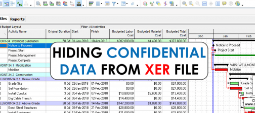
Schedule presentation is an important thing to count while submitting a PRIMAVERA P6 schedule to your Client, Consultant or any other stakeholder. Presentation is a key factor in any type of project, program or product introduction among vendors. Presentation can be defined as something set forth for the attention of the mind. While we are presenting our schedule, it should be eye catching and full of relevant required information, which depicts your work in a professional way. If you have done a great work in schedule preparation, and you have prepared a schedule which is technically good, but your presentation is not so good, then you cannot get the expected reward. It will be similar to the saying that “first impression is last impression.” In this article, I will try to summarize schedule presentation tips and its importance, to the best extent.
Usually we are submitting our project schedule in PDF format instead of an XER file of PRIMAVERA. So the details which we have printed in PDF are only source of information about the project. In schedule presentation printing is the main factor which should be considered. Therefore, after a bit of hard work in preparing schedule, if we put up some good efforts in schedule printing and submission, our efforts will become more fruitful.
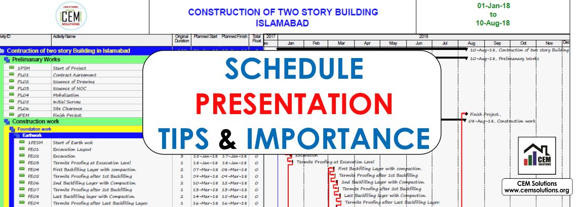
Some schedule presentation tips will be discussed here, which will be helpful.
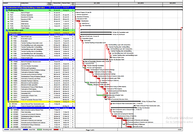
The schedule above looks pretty good, but still there are some areas of concern related to presentation. Technically we assume that the plan is finalized. But if we zoom in the above picture we will find following certain things.
From Gantt chart, I cannot find project start and end month as shown in picture below:
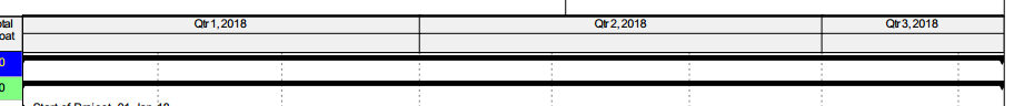
There are two reasons behind this:
- Firstly, the project printed time frame is not managed properly.
- Secondly, the time bar at the top marked in green color is not customized to proper month name format.
The first point can be fixed by customizing the print setting in print preview tab, click on paper layout option at right side top corner. In option, provide print limits custom dates instead of PS and PF dates. To manage project start and end legends with in print area, provide dates a month before PS and a month after PF dates to set print area limits.
Second point can be fixed easily. Go to bar chart options by clicking right in bar chart portion and change time scale from quarter/year to month/year.
Further note that, in the picture below, the Header area is empty.
![]()
This is also an important point. Little bit of editing here will give your schedule a smart look.
Header is divided into three portions and we can add anything in the header according to our requirements. Primavera P6 has following available header options. We can choose any from them. Also note that all three sections of header contains these options. You can also divide the sections of header to any number you want.
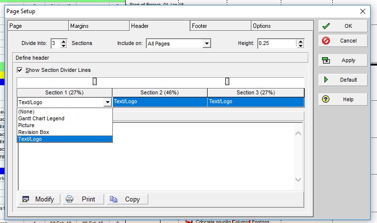
Now, suppose that we want to add logo of company to right side, Project Name in center and Project start and finish dates to left side in header. To do this, we can use a general option Text / Logo from drop down box in each portion of header. After putting information in header we also have to change header height as our requirement. After making changes in header we can see that our schedule is more eye catching.
See below the footer portion of the schedule:
![]() Red bar’s legend has its description hidden. This will be resolved easily by customizing footer height in print preview section. Also we can add the person name who prepared schedule or its signature etc. instead of oracle in green marked area. Same like header we can make all these changes in footer options in Primavera P6 print preview window. After all these changes, our footer will be look like this:
Red bar’s legend has its description hidden. This will be resolved easily by customizing footer height in print preview section. Also we can add the person name who prepared schedule or its signature etc. instead of oracle in green marked area. Same like header we can make all these changes in footer options in Primavera P6 print preview window. After all these changes, our footer will be look like this:

Although above mentioned points are more important to consider. There are some other general settings too which can be considered like:
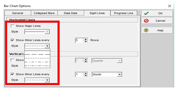
Check horizontal/vertical sight lines in Bar Chart. These lines may disturb Activity Relations as shown in figure below:
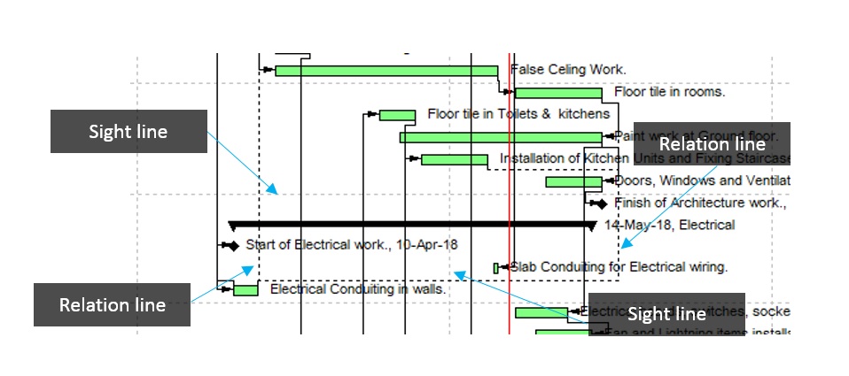 When required, we can uncheck sight lines in bar chart options or we can change sight lines type.
Check that all information is in between printing limits nothing is shortened or cut.

In left figure, the problem will be solved by managing print area as described above.
In right figure, the problem is with column width, and can be resolved by setting columns width.
Check the outside margins. To use more space of page we can provide narrow margins to printing area as shown below:
 Check Bar chart/Activity column’s font style, background color & Row height. You can customize them in table and fonts as shown below:

The picture below shows a background with grey color and font style Segoe print.

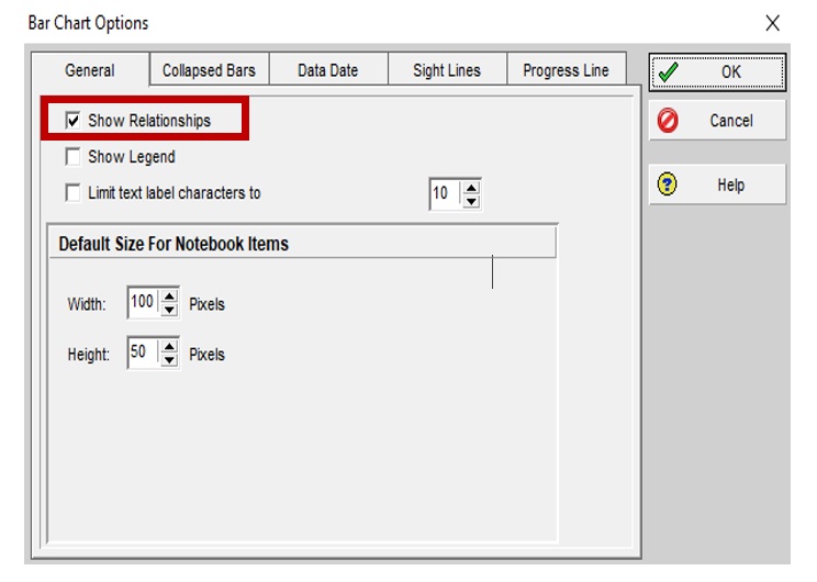
Sometimes, client do not require links in schedule. For this purpose, make relationships option unchecked in bar chart options before printing. Picture is shown below:
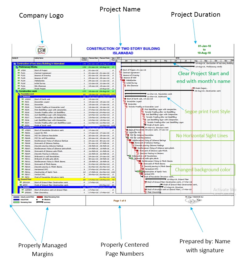
All the above mentioned tips and methods will cover maximum things to make any schedule best presentable in front of client. It is not necessary to make all the above mentioned changes in your schedule but you can do as much as required. Determination yields good result. If you want to do something good and you are fighting for that then new ways will be opened for you and you will get the best according to your efforts. Incorporating all above changes, the schedule will look like as below:
You can download the PDF file of this schedule from here.